Risk Calculation
How to mislead in numbers without even trying
One frequent question about vaccines is "Do they even work? How do we know that these diseases didn't just disappear on their own? Aren't we cleaner and healthier than 100 years ago and couldn't that be it?" To answer these questions, it is very important to understand the way numbers are reported.
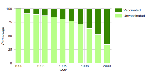
Suppose you are listening to the radio and you hear that there is an outbreak of fauxinia(1). Six vaccinated people got sick and four unvaccinated people got sick. Is it better to be vaccinated or unvaccinated?
What about if you saw this graph about cases of fauxinia in the years after vaccination started?:
What exactly is going on?
What is the question?
The above information seems to say something bad about the fauxinia vaccine. But the strange truth is that there is not actually enough information here to conclude that. What you probably want to know in an outbreak situation is "What is the chance of getting sick if you are unvaccinated?" (And is this different if you are vaccinated)? The information I gave you above only answers the question "What is the chance of being unvaccinated if you are sick?"
These things sound similar, but they are not actually the same(2). It can be confusing(3), so let's look at some numbers.
Denominators matter
Sick People
Whole Population
*This assumes that the probability of getting sick if unprotected is the same, no matter the vaccination rate. This is not the case for contagious diseases, where high levels of vaccination can interrupt the spread. See here for more.
The top-left graph is like the one I showed before: it says what percentage of sick people are vaccinated versus unvaccinated, although the bottom axis now shows the "vaccine coverage" (how many people in the whole population are vaccinated) instead of the year. The top-right graph shows the percentages of people in the whole population who are in each group (sick and vaccinated, sick and unvaccinated, healthy and vaccinated, healthy and unvaccinated).
The second graph still shows the same seeming-paradox as the first: as coverage goes up, more vaccinated people get sick (dark green versus light green), but two other things become clear. (1) There are also more healthy vaccinated people (dark purple) because there are more vaccinated people total (dark purple + dark green). (2) Fewer people in the whole population are getting sick as coverage goes up (light+dark greens gets smaller and light+dark purples gets larger). It is not a paradox at all: there are more vaccinated people as coverage goes up (that's what vaccine coverage means), so more vaccinated people are sick and more vaccinated people are healthy.
The numbers can be rearranged into the pie charts in the bottom row and these charts finally answer the question we were interested in: is your chance of getting sick higher if unvaccinated? For the numbers that show up when you first load the page, the answer is yes. At 90% coverage, the bottom-right graph shows that for every 100 people, 90 will be vaccinated and 13.5 of them got sick. That's 13.5/90=15% of them, as shown in the pie chart on the left. Ten people will be unvaccinated, but all of them get sick (middle pie chart). So, yes, about 23 people got sick - 13 vaccinated, 10 not - but actually your chance of getting sick if unvaccinated is 100% while your chance of getting sick if vaccinated is only 15%.
The graphs are interactive, so you can play around with some of the assumptions I made.
- The efficacy tells you, if you get vaccinated, how likely the vaccine is to protect you. It's true that sometimes vaccinated people get sick because the vaccine didn't work for them, but it is also true that even a 10% effective vaccine is 10% more effective at preventing disease than not getting the vaccine(4).
The probability of getting sick if unprotected shows the chance that you will get sick if you are not vaccinated or the vaccine didn't take. This is initially set to 1 in 1, which is why all of the unvaccinated people get sick(5), but you can change it to see what things look like if the chance of getting sick if unprotected are only 1 in 50. This will, of course, also change the probability of getting sick for those who got vaccinated but it didn't take, so changing the probability of getting sick does not change the relative percentages of vaccinated and unvaccinated sick people (in the top-left graph); it only changes the percentage of sick people in the whole population (top-right graph).
One problem with the calculation here, which I noted at the *, is that it assumes that if you are unprotected, your chances of getting sick do not depend on the vaccine coverage. You might think that this is reasonable because how could someone else being vaccinated affect your chance of getting sick and, for diseases that are not person-to-person transmissible, like tetanus, that makes sense. But for more contagious diseases, this assumption is wrong.- You can click on the bars in either of the top two graphs to change the coverage rate that the pie chart numbers show. This doesn't actually change the relative percentages shown in the first two graphs, but it will change the overall numbers you see if you hover over the slices as well as the percentages in the bottom-right graph.
Feel free to play around with these numbers because vaccine efficacy, coverage and probabilities of getting sick do vary for different diseases and situations. Some of the things I noticed are described in the next section, but you might find others that interest you.
Some things to explore
The vaccine does not have to be 100% effective to reduce the number of sick people. You can lower the efficacy down to 80%, 50% and below and the green "sick" bars will still go down as coverage goes up and more people get vaccinated. Fifty percent effective is not the same as 0% effective. That's math that can be tough to understand when you're the one stuck in bed with the flu even though you got vaccinated, but it's still math.
Sometimes people say you don't need to get vaccinated because you could just, say, wash your hands more and that helps prevent disease. And for some (but not all) diseases this does decrease your chance of getting sick, but that would be true for everyone, vaccinated and unvaccinated. If you select a lower probability of getting sick, it decreases the total number of sick people, but it doesn't affect the relative percentages of vaccinated versus unvaccinated sick people. Hand washing provides additional protection for both groups.
Finally, I just want to show you that you can double check the numbers coming out of these graphs (don't panic: no serious math required!) in case it all seems like a little bit of black magic. Put the probability of getting sick at 1 in 1 and click on one of the bars at 90% coverage.
Now imagine a group of 100 people. Ask yourself, if the vaccine does not work at all (0% effective), how many of those people should get sick? Set the efficacy to 0 and check(6).
Still with me? Now imagine a completely (100%) effective vaccine. How many of those 100 people get sick? This is trickier to answer because it depends how many of them are vaccinated. What if all of them are vaccinated? What if none of them are? What if 90 people are vaccinated; how many of them should get sick if the vaccine is 100% effective? Now set the efficacy to 100% and check(7).
So, to recap for 90% coverage, when the vaccine is 0% effective, 10 unvaccinated people and 90 vaccinated people get sick. When the vaccine is 100% effective, those 10 unvaccinated people still get sick, but no vaccinated people do. So what are the numbers at 90% coverage for a vaccine that is 85% effective? You might not be able to tell me the exact number for vaccinated sick people, but you can probably make a pretty good guess. Set the efficacy to 85% and see how close you got(8).
If none of that made sense, I am sorry for all of the math, but the basic point is that to know the chance of getting sick if you are vaccinated, it is not enough to know how many sick people are vaccinated. You also need to know either how many healthy people are vaccinated or how many people in the whole population are vaccinated. There can be more vaccinated people getting sick just because there are more of them around in the first place.
What's next?
Now you hopefully understand the difference between the probability of being vaccinated if you are sick and the probability of getting sick if you are vaccinated. So that tells you how much more likely you are to get sick if you are unvaccinated, but how likely are you to get sick at all? This depends on how likely you are to run into the disease and, since diseases live in the humans they infect, that depends on how many infected people are wandering around and that, in the confusingly circular nature of vaccination, depends on whether the people out there around you are vaccinated. And that is a whole new set of graphs.
Footnotes
- a disease I made up for illustration purposes, although the graphs were inspired by this presentation on varicella (chicken pox), which shows the percentages of vaccinated and unvaccinated people following the start of a vaccination program.
- They are related, but they are related by information that is not given above: how many people are vaccinated?
- It is so confusing that it actually has its own name in science, "the denominator problem". The denominator is the bottom part of a fraction that says what group you are interested in: eg. sick people or the whole population. ("Denominator problem" is also sometimes used to refer to situations where the denominator is unknown).
- In some cases, even when the vaccine fails and you get sick, the symptoms are not as severe or don't last as long as they would have if you hadn't been vaccinated.
- This starts at 1 in 1, meaning that if you are not protected then you will certainly get sick. This might seem unrelatistic in our modern world, but historically this was nearly the case for measles before the vaccine (In the 1920s, 95% of children in US cities were reported to have had measles by age 15). If you are an old like myself, you may remember a time when chicken pox swept through your school and nearly everyone in the class got it. Indeed it was relatively unusual to make it to adulthood without catching the chicken pox at some point. These diseases are, however, on the more contagious end of the spectrum, whereas something like ebola is very unlikely to spread if precautions are taken. So an accurate choice of probability will be different for different diseases.
- Nobody is protected, vaccinated or unvaccinated, so all 100 people will get sick. That is why the top-left and top-right graphs look the same: because the number of sick people and the number of people are the same. And the percentages in the bars match the coverage: at 90% coverage, 90 of those 100 people are vaccinated, but it doesn't matter because the vaccine doesn't work so all of them get sick. And 10 people are unvaccinated and all of them also get sick. The vaccinated bar is 9 times larger than the unvaccinated bar at 90% coverage in the 0% efficacy situation.
- In the top-left graph, 100% of people who get sick are unvaccinated and no vaccinated people get sick, regardless of coverage. That makes sense. In the right-hand graph, again no vaccinated people get sick, but the number of unvaccinated people getting sick goes down because there are fewer of them as more and more people get vaccinated. So things might appear better if you don't pay any attention to what the bottom axis represents, but actually your chances of getting sick if you are unvaccinated are the same as they ever were: 1 in 1 (we set that above). The bar at 90% coverage should say 10 of those 100 people get sick and all of them are unvaccinated and that's all of the unvaccinated people there are! The vaccinated bar is infinitely smaller than the unvaccinated bar at 90% coverage in the 100% efficacy situation
- The number of people who are sick and unvaccinated at 90% coverage is always the same at 10 (all of them, or 100%). You probably expect the number of vaccinated sick people to be somewhere between the number of 0 for a 100% effective vaccine and 90 for a completely ineffective vaccine and maybe closer to that first number since 85% efficacy is closer to 100% efficacy. And if you set the efficacy to 85%, that's just what you see: 13.5 of those 100 people are sick and vaccinated.
This is larger than 10 people who are sick and unvaccinated, but you are much much better off being vaccinated because your likelihood of getting sick is no longer 100%, but is in fact 13.5/90 (and in fact 13.5/90=15%, which is what you would expect for an 85% effective vaccine where for every 100 people vaccinated, you have an 85% chance of being protected and a 15% chance of being unprotected and getting sick). If you look at the size of the bars at 90% coverage, you see that the vaccinated bar is a little bit larger than the unvaccinated bar, but that doesn't mean the vaccine doesn't work (in fact, we know from the 0% efficacy experiment we did that the bar could be up to 9 times larger and that would still mean the vaccine was effective because of how many vaccinated people there are).